

Understanding the Opportunity
People use different apps for every part of the concert experience.
People check YouTube or TikTok for videos, Reddit and forums for reviews, Instagram for photos, streaming services for setlists, and Twitter for live updates. Nothing brings the full before, during, and after experience into one place.
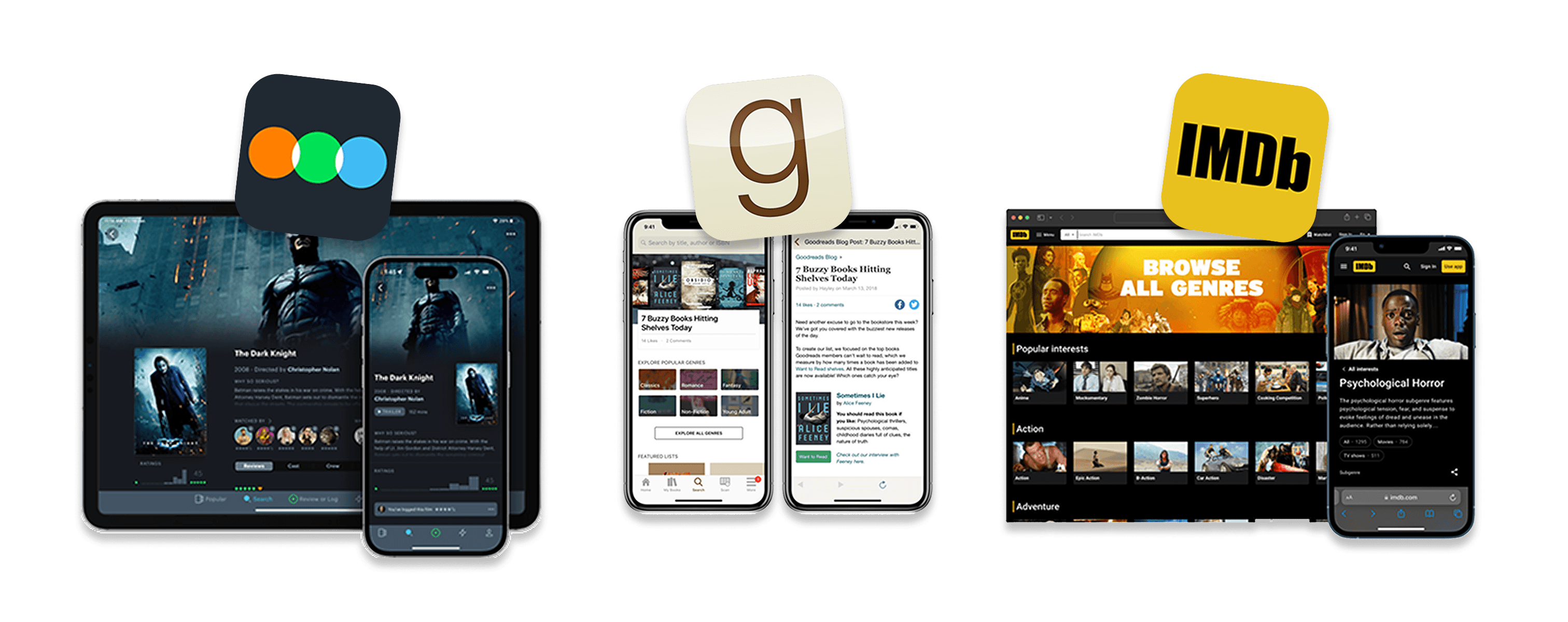
To understand what people needed, I reviewed indirect competitors like Letterboxd and Goodreads to see how they organize event-based content. Then
3 Types of Users
Next, I ran a national usertesting.com study with 150 participants to learn how concert-goers prepare for shows, capture moments, and revisit them after.
Three user groups shaped the structure of the product:
Guiding the Experience
The research highlighted key patterns, which I turned into guidelines for how the product should work:
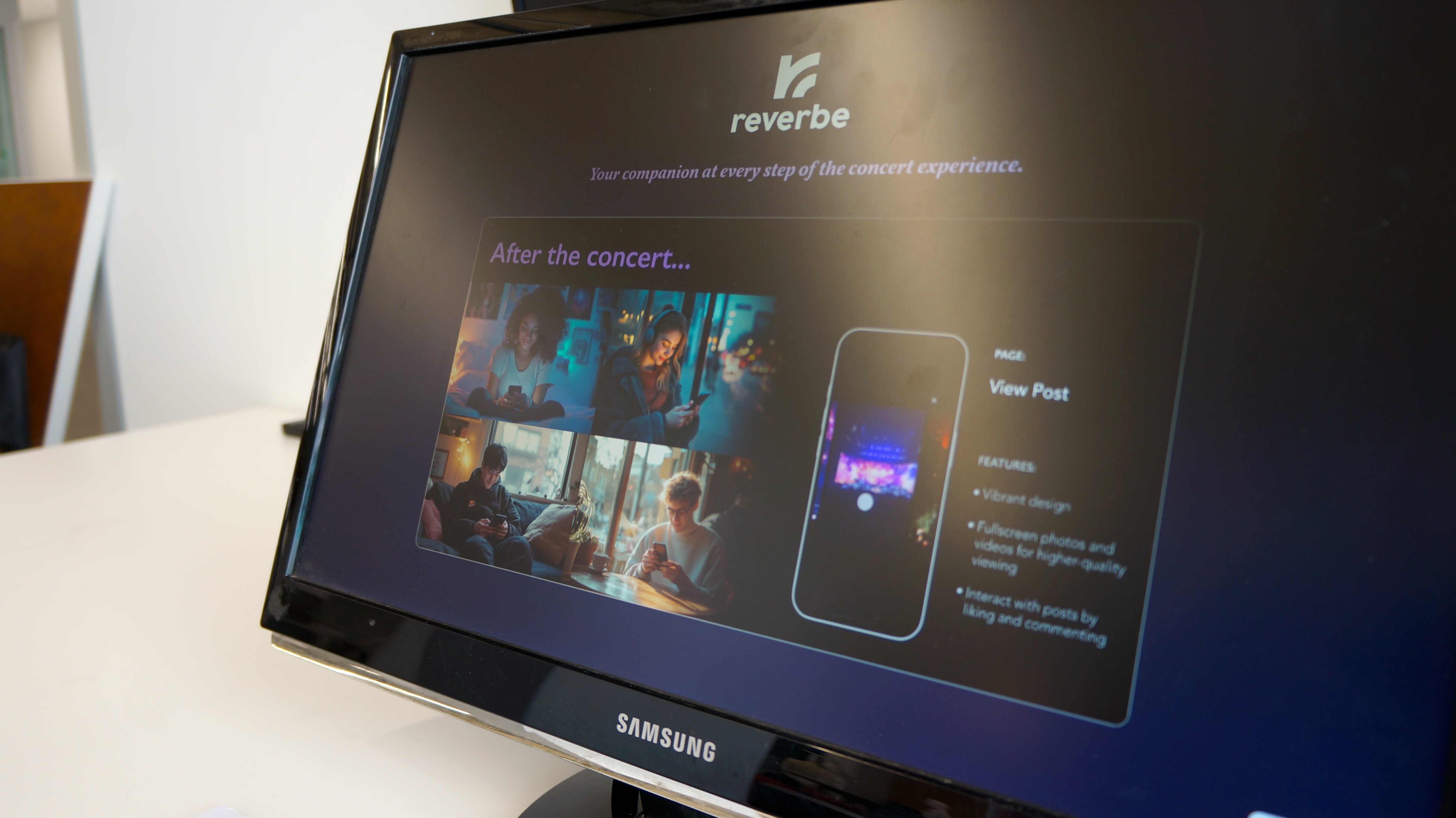
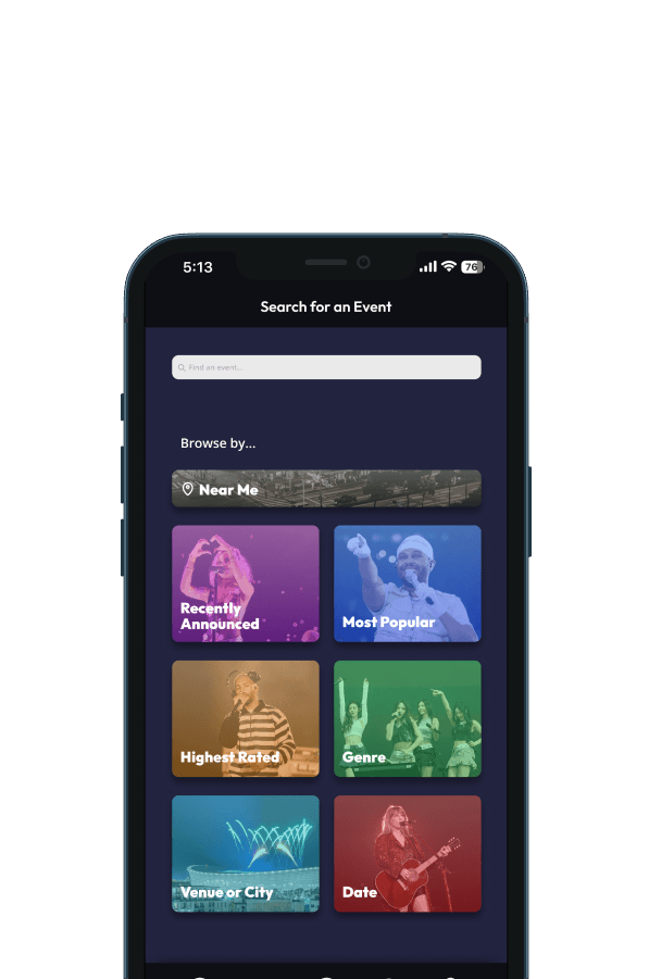
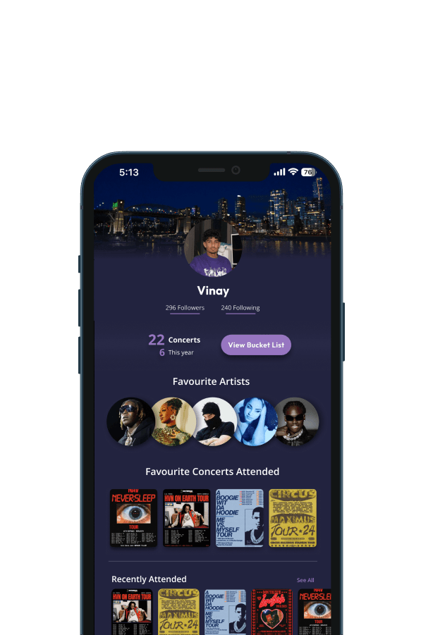
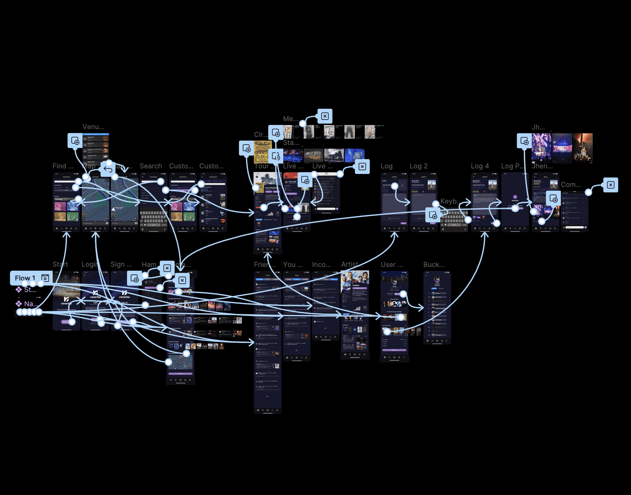
The First UI Design
The first version of the interface focused on simplicity. Each page showed only the essential actions, based on what users said mattered most. The prototype included a customizable profile, event discovery, a concert-logging flow, and browsing features.


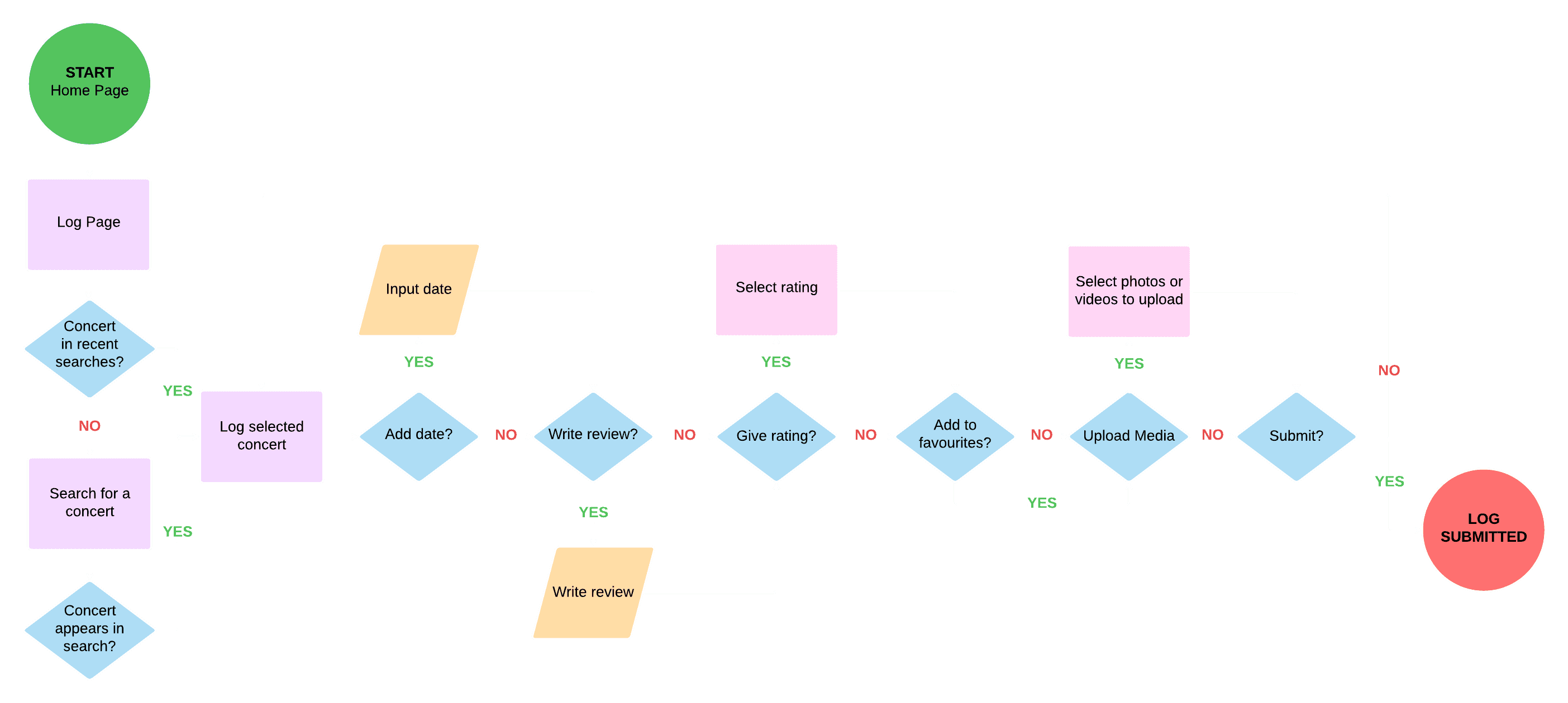
Logging a Concert Experience
To make the concept interactive for critique, I coded a simple concert-logging system in p5.js. The flow included selecting a concert, writing a short entry, and submitting it. This allowed people to contribute entries live during the demonstration.
User Testing the Concert-Logging Interaction
During the mid-project critique, visitors interacted with the installation by submitting their own entries through a singular laptop. These appeared in real time on the large display, which helped validate the core interaction.
Feedback from students and faculty highlighted improvements for clarity and suggested new features, which guided later iterations.
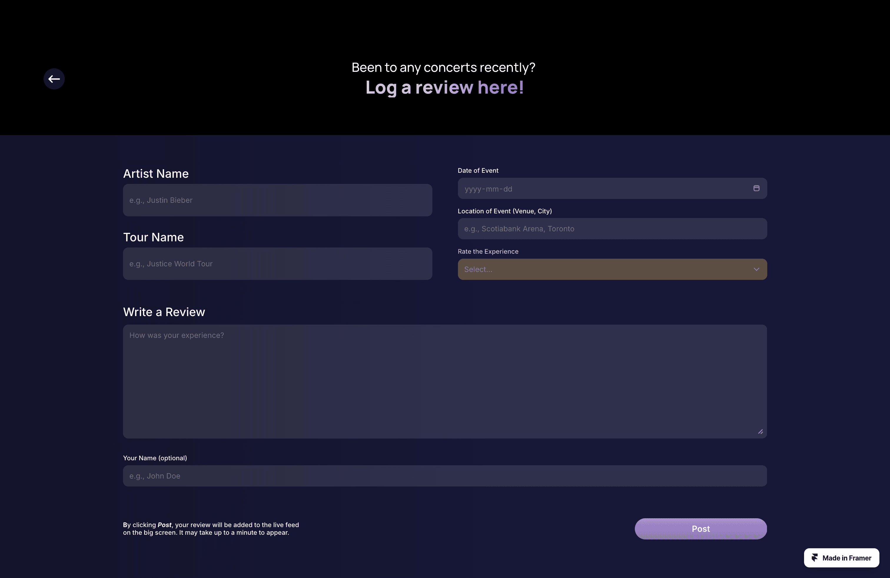
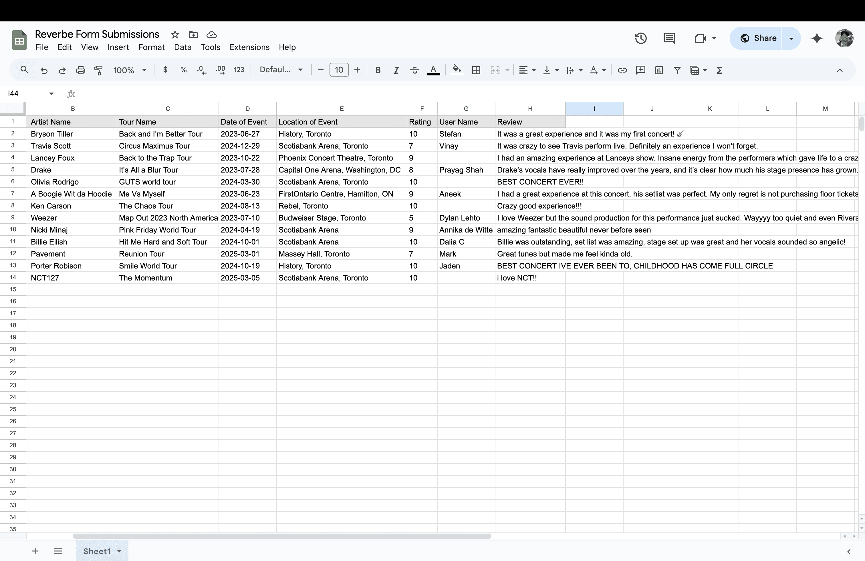
A Better Submission System
The input form was effective, but I needed a way to store responses permanently and allow multiple users to log a concert at the same time. To solve this, I moved the review input to a mobile-friendly form built in Framer. Submissions went directly to a Google Sheet, which served as a simple database.
A Processing sketch pulled from the sheet and refreshed regularly, creating a live feed that updated whenever new entries were submitted.
The QR code allowed people to scan, submit from their phones, and see their entry appear almost immediately on the display.

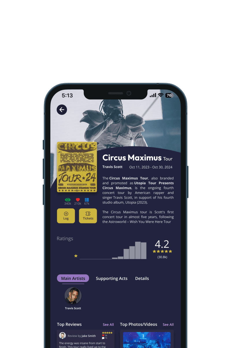
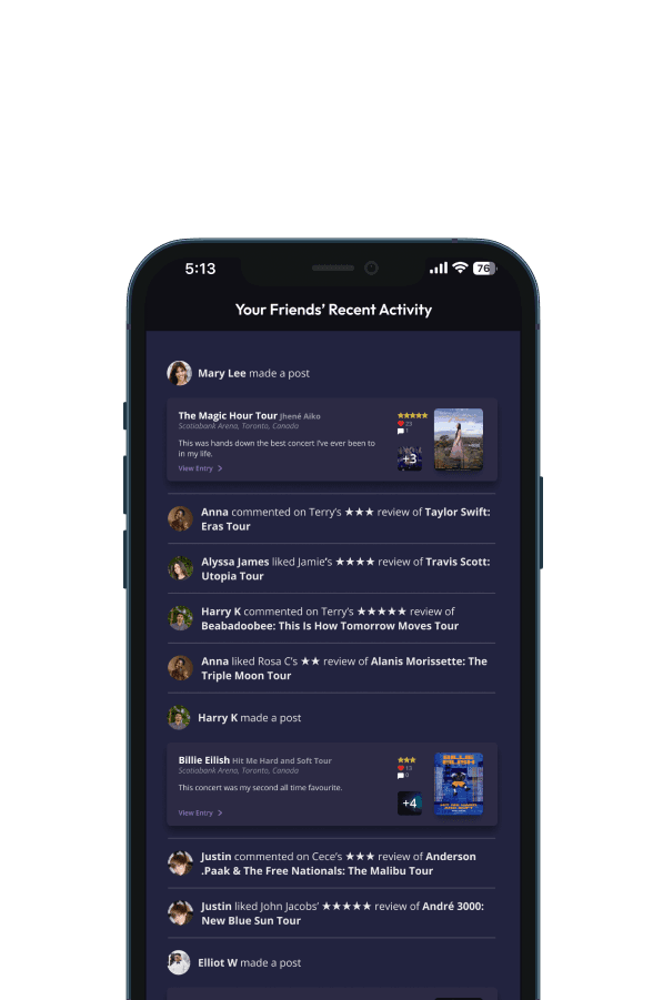
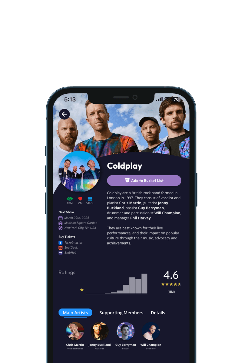
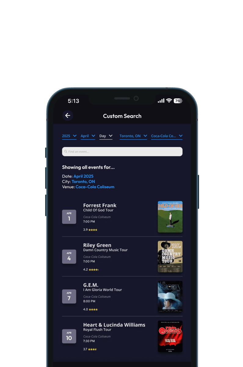
Expanding the UI
After testing, I expanded the interface to support more of the concert experience. New features included:
User posts
Artist profiles
Custom search
A live concert feed (a highly requested addition)
The live feed covers details people typically check during a show, such as what is currently playing, merch updates, and general event insights.
I recorded the interface, added motion in After Effects, and prepared a polished walkthrough for display.


Public Demo at the Final Showcase
At the final showcase, Reverbe ran in a gallery space as a looping installation. Visitors could explore the UI, see the live feed update, and contribute their own reviews by scanning the QR code. Many stayed to explore what others wrote.
User Journey Walkthrough Video
To communicate how Reverbe fits into the before, during, and after experience, I created a short video highlighting each stage of the journey. This ran alongside the live feed, giving viewers a clear sense of how the product would function in a real concert context.